R 그래픽스 활용2
1. 라이브러리 로드
1
2
3
4
5
6
7
8
library(tidyverse) # metapackage of all tidyverse packages

# Input data files are available in the read-only "../input/" directory
# For example, running this (by clicking run or pressing Shift+Enter) will list all files under the input directory

list.files(path = "../input")
org_df <- read_csv("/kaggle/input/kospi-20240308-csv/kospi_20240308.csv", show_col_types = FALSE)
tail(org_df)
1
2
3
4
5
6
7
8
9
10
── [1mAttaching core tidyverse packages[22m ──────────────────────── tidyverse 2.0.0 ──
[32m✔[39m [34mdplyr [39m 1.1.4 [32m✔[39m [34mreadr [39m 2.1.4
[32m✔[39m [34mforcats [39m 1.0.0 [32m✔[39m [34mstringr [39m 1.5.1
[32m✔[39m [34mggplot2 [39m 3.4.4 [32m✔[39m [34mtibble [39m 3.2.1
[32m✔[39m [34mlubridate[39m 1.9.3 [32m✔[39m [34mtidyr [39m 1.3.0
[32m✔[39m [34mpurrr [39m 1.0.2
── [1mConflicts[22m ────────────────────────────────────────── tidyverse_conflicts() ──
[31m✖[39m [34mdplyr[39m::[32mfilter()[39m masks [34mstats[39m::filter()
[31m✖[39m [34mdplyr[39m::[32mlag()[39m masks [34mstats[39m::lag()
[36mℹ[39m Use the conflicted package ([3m[34m<http://conflicted.r-lib.org/>[39m[23m) to force all conflicts to become errors
‘kospi-20240308-csv’
| date | open_price | high_price | low_price | trade_price | volume |
|---|---|---|---|---|---|
| <date> | <dbl> | <dbl> | <dbl> | <dbl> | <dbl> |
| 2024-02-29 | 2643.48 | 2647.56 | 2628.62 | 2642.36 | 496064469 |
| 2024-03-04 | 2664.52 | 2682.80 | 2662.32 | 2674.27 | 404014324 |
| 2024-03-05 | 2660.80 | 2684.83 | 2649.35 | 2649.40 | 457237152 |
| 2024-03-06 | 2638.84 | 2649.78 | 2630.16 | 2641.49 | 378993989 |
| 2024-03-07 | 2653.98 | 2660.26 | 2633.57 | 2647.62 | 462910823 |
| 2024-03-08 | 2676.79 | 2688.00 | 2668.38 | 2677.22 | 435697586 |
1
2
3
4
5
6
# Function to set Height & Width
fig<-function(x,y){
    options(repr.plot.width = x, repr.plot.height = y)
    }

fig(12,8)
2. 막대그래프 그리기
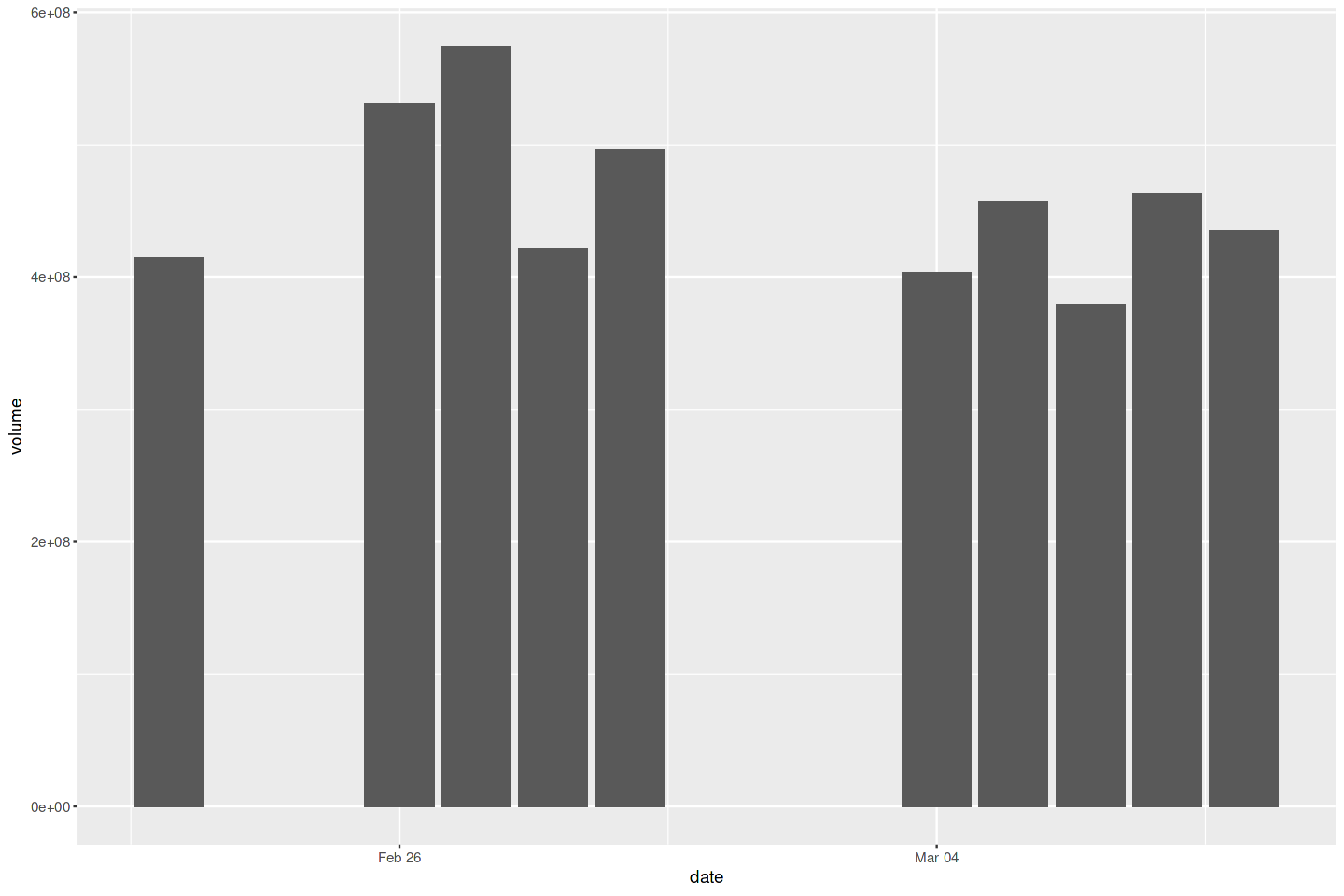
문제 : 막대그래프를 그리고 싶다.
해결책 : ggplot의 geom_bar 함수를 사용하면 높이를 막대로 그릴 수 있다. 데이터가 이미 집계된 상태라면, stat = “identity”를 추가해서 ggplot이 그래프를 그리기에 앞서 집단별 집계를 하지 않도록 하면 된다.
1
2
3
df = tail(org_df, 10)
ggplot(df, aes(x=date, y=volume)) +
       geom_bar(stat = "identity")
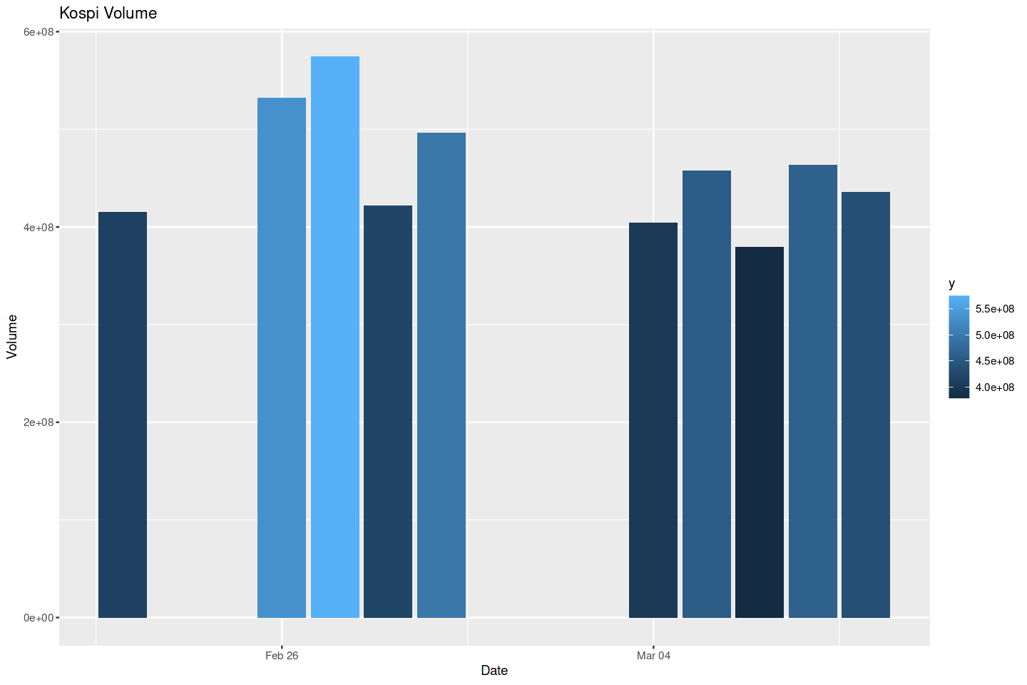
3. 막대그래프 칠하기
문제 : 막대그래프의 막대에 색을 칠하거나 음영을 넣고 싶다.
해결책 : ggplot에서 fill 매개변수를 aes 호출에 추가한 다음 ggplot이 색을 선정하도록 할 수 있다.
1
2
ggplot(df, aes(x=date, y=volume, fill = date)) +
       geom_bar(stat = "identity")

1
2
3
4
ggplot(df, aes(x=date, y=volume, fill = ..y..)) +
        geom_bar(stat = "identity") +
        labs(title = "Kospi Volume", x = "Date", y="Volume")
1
2
3
Warning message:
“[1m[22mThe dot-dot notation (`..y..`) was deprecated in ggplot2 3.4.0.
[36mℹ[39m Please use `after_stat(y)` instead.”
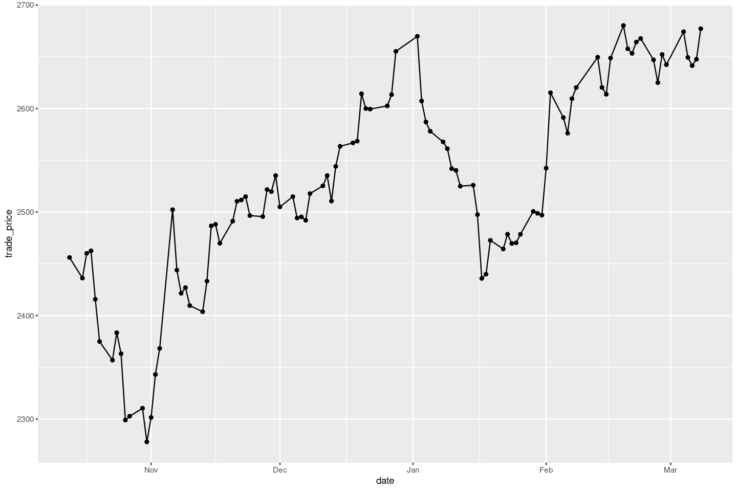
4. x와 y점으로 선 그리기
문제 : (x1,y1),(x2,y2),…,(xn,yn)처럼 쌍으로 된 관찰들이 데이터 프레임에 들어있다. 각 데이터 점을 연결하는 연속적인 선분들을 그리고 싶다.
해결책 : 점을 나타애기 위해서는 geom_point, 선을 나타내기 위해서는 geom_line을 사용한다. 두 종류의 도형을 함께 생성하는 방법으로 쉽게 점과 선을 함께 넣을 수 있다.
1
2
3
4
df = tail(org_df, 100)
ggplot(df, aes(x=date, y=trade_price)) +
    geom_point() +
    geom_line()
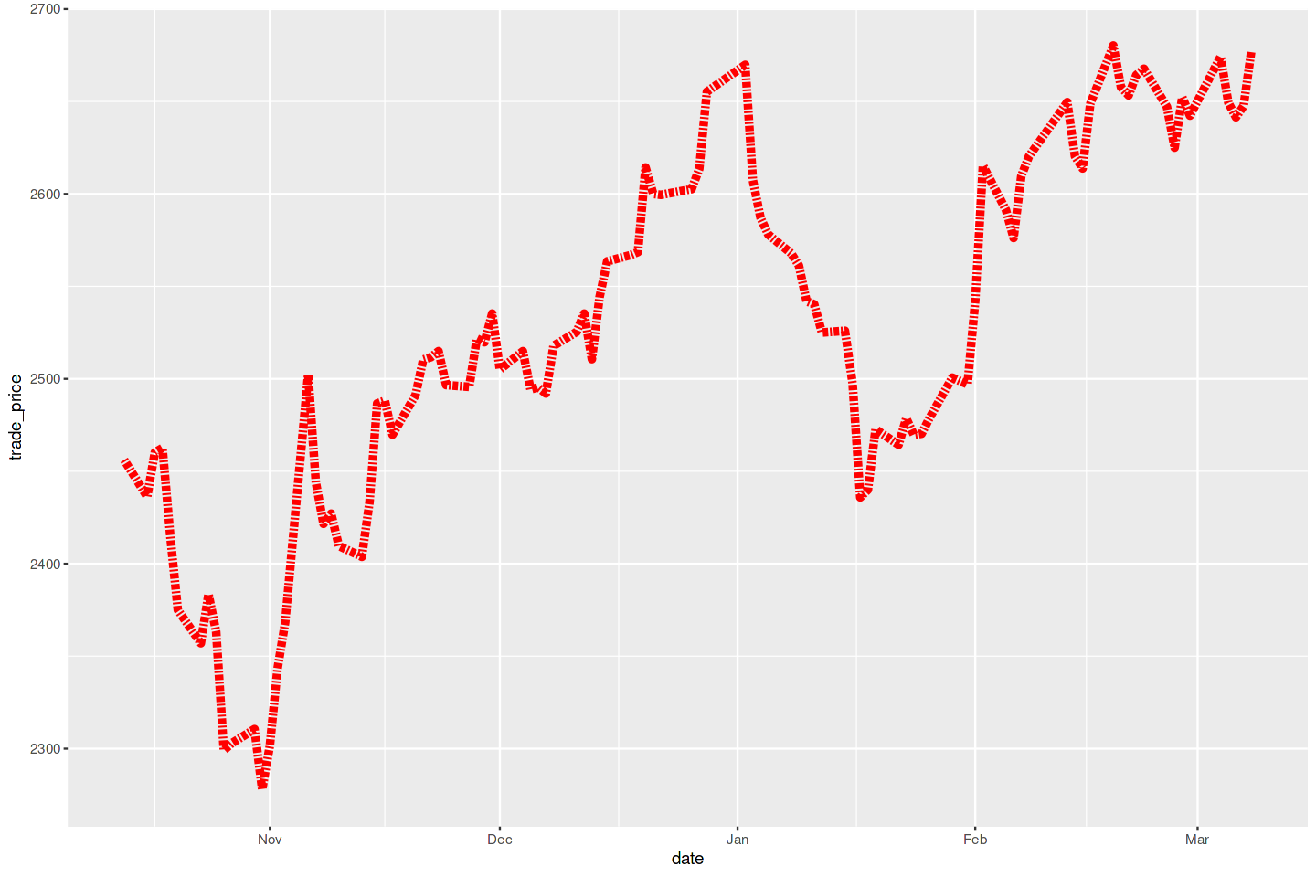
5. 선의 유형, 두께, 색상 변경하기
ggplot 함수는 선의 외형을 조절하는 매개변수들을 가지고 있다. 옵션은 다음과 같다.
- 실선(기본): linetype=”solid” 또는 linetype=1
- 대시선: linetype=”dashed” 또는 linetype=2
- 점선: linetype=”dotted” 또는 linetype=3
- 점대시선: linetype=”dotdash” 또는 linetype=4
- 긴 대시선: linetype=”longdash” 또는 linetype=5
- 이중 대시선: linetype=”towdash” 또는 linetype=6
- 없음(그리기를 막음): linetype=”blank” 또는 linetype=0
1
2
3
4
ggplot(df, aes(x = date, y = trade_price)) +
    geom_line(linetype = 6,
              linewidth = 2,
              col ="red")
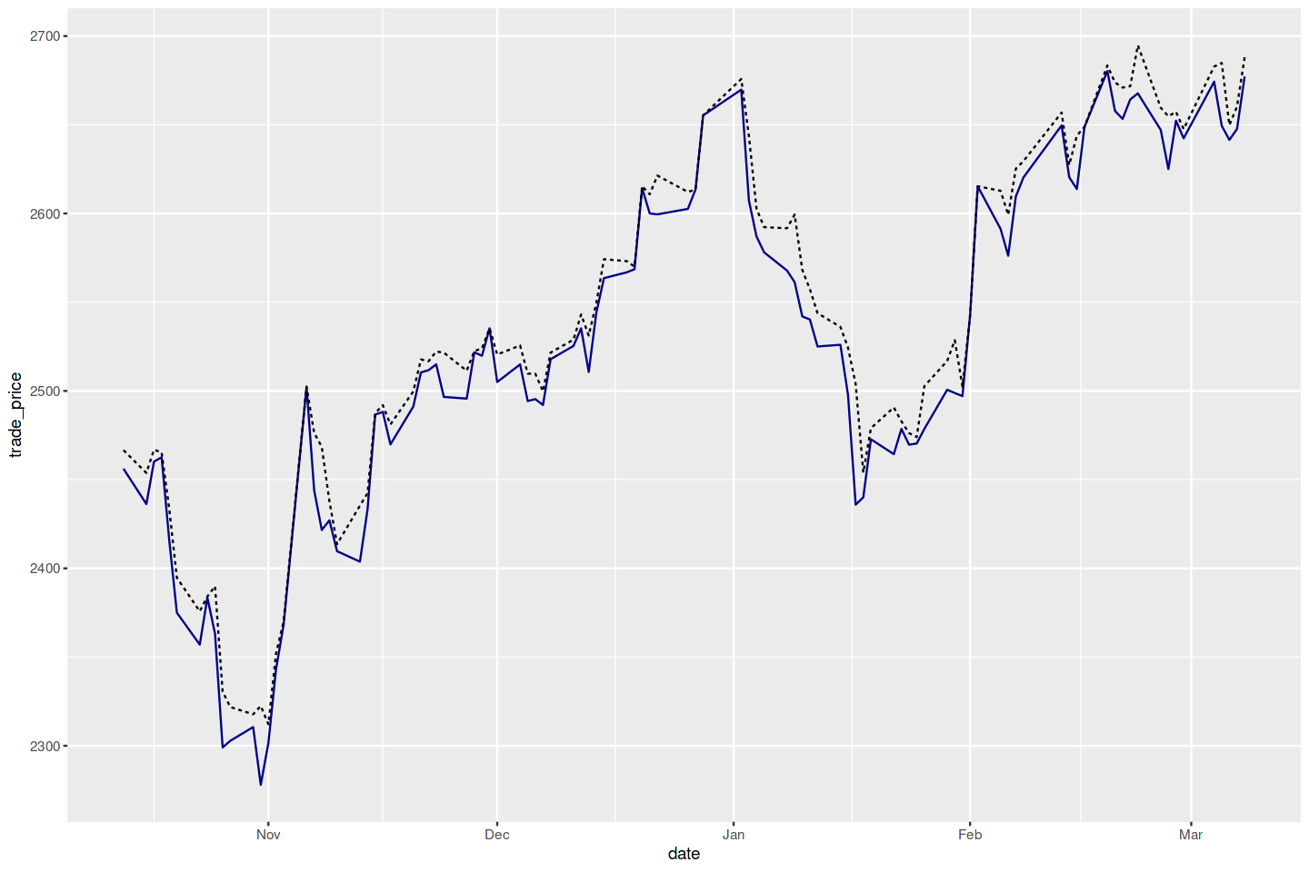
6. 여러 개의 데이터세트를 그래프로 그리기
문제 : 하나의 그래프에 여러 개의 데이터세트를 보여 주고 싶다.
해결책: 빈 그래프를 만들고 두개의 다른 도형을 추가하는 방법으로 ggplot 개체에 여러 데이터 프레임을 추가할 수 있다.
1
2
3
4
df1 <- df2 <- df
ggplot() +
    geom_line(data=df1, aes(date, trade_price), color = "darkblue") +
    geom_line(data=df2, aes(date, high_price), linetype = "dashed")
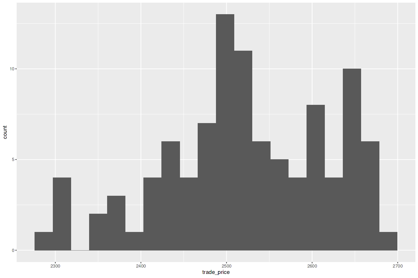
7. 히스토그램 그리기
문제 : 데이터로 히스토그램을 그리고 싶다.
해결책 : geom_histogram을 사용하되 x를 수치형 값으로 이루어진 벡터로 준다.
1
2
3
4
df = tail(org_df, 100)
ggplot(df) +
    geom_histogram(aes(x=trade_price), bins=20)
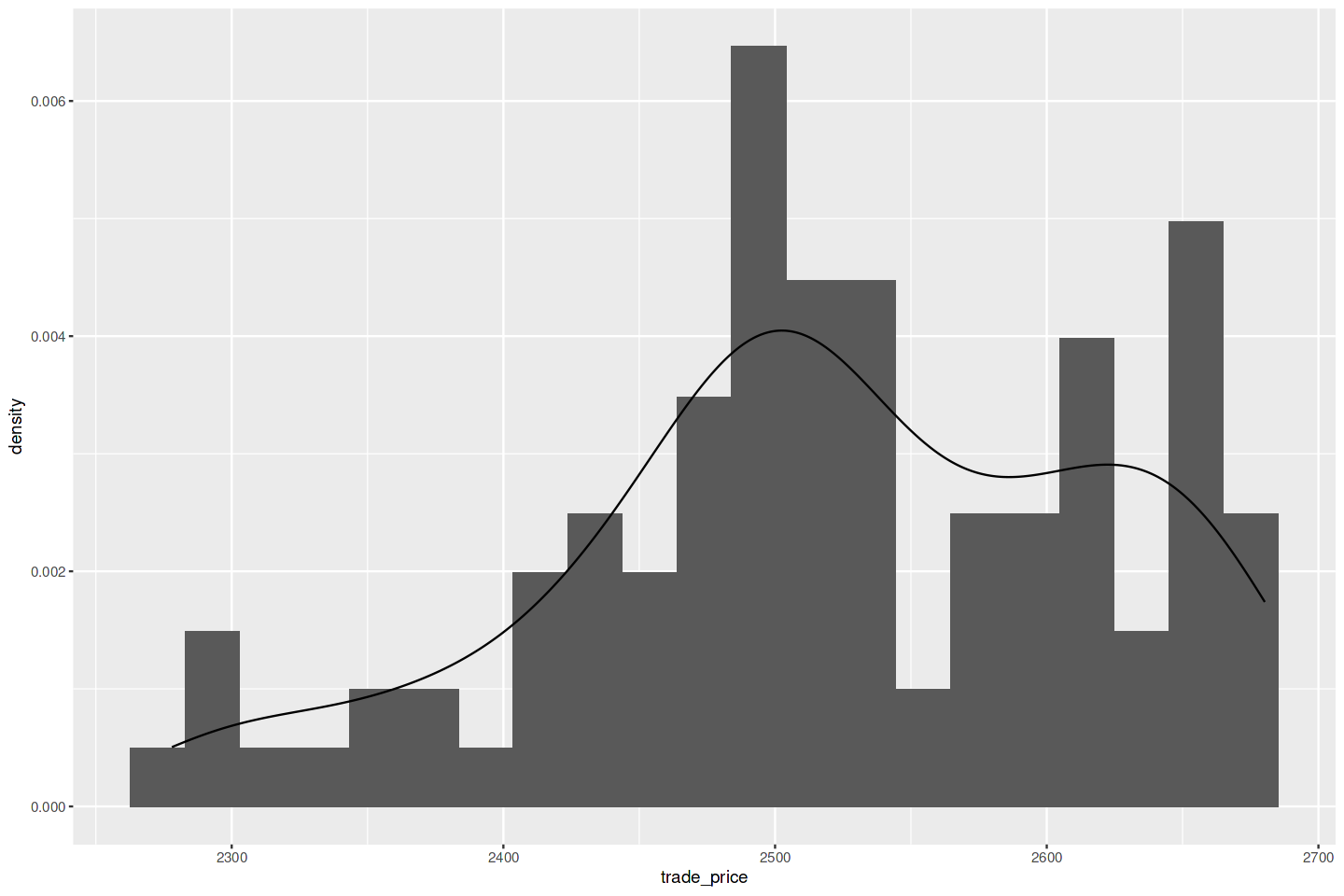
8. 히스토그램에 추정 밀도 추가하기
문제 : 데이터 표본으로 만든 히스토그램이 있는데, 여기에 추정된 밀도를 나타내기 위해서 곡선을 추가하고 싶다.
해결책 : geom_density 함수를 사용해서 표본 밀도의 근사치를 선으로 그린다.
1
2
3
4
5
df = tail(org_df, 100)
ggplot(df) +
    aes(x = trade_price) +
    geom_histogram(aes( y=..density..), bins=21) +
    geom_density()
9. 정규분포의 분위수-분위수 그래프 그리기
문제 : 데이터의 분위수-분위수(Q-Q) 그래프를 생성하고 싶다. 일반적으로 데이터가 정규분포와 얼마나 다른지 알고 싶은 경우에 많이 사용한다.
해결책 : ggplot에서 stat_qq와 stat_qq_line 함수를 사용해서 관찰값을 나타내는 점들과 함께 Q-Q 선이 들어 있는 분위수-분위수(Q-Q) 그래프를 그릴수 있다.
1
2
3
ggplot(df, aes(sample=trade_price)) +
    stat_qq() +
    stat_qq_line()
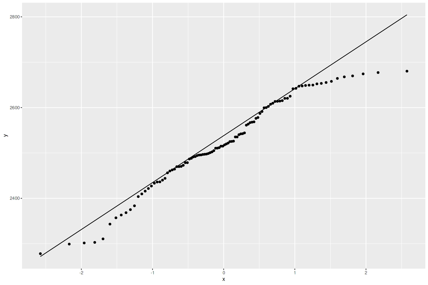
데이터가 정규분포인지 아닌지를 아는게 중요할 때가 있다.(정규분포는 데이터가 평균을 중심으로 좌우 대칭인 종 모양의 분포를 가지는 확률 분포). 이럴 때 Q-Q 그래프로 가장 먼저 확인해보면 된다. 데이터가 완벽히 정규분포 형태라면, 점들은 정확하게 대각선 위에 있을 것이다. 하지만 이 그래프를 보면 많은 점이 중간 부분에서는 대각선에 가깝지만, 끝으로 갈수록 꽤 떨어져 있다. 결론적으로 코스피 지수는 정규분포가 아니라고 볼 수 있다.
Chatgpt: 코스피나 코스닥 지수와 같은 금융 시장 지수는 엄밀히 정규분포를 따르지 않습니다. 실제 금융 시장의 수익률 분포는 뾰족한 정상(Leptokurtic)과 두꺼운 꼬리(Fat tails)를 가진 경향이 있어, 정규분포보다 극단적인 값이 더 자주 나타납니다. 이러한 특성은 ‘금융 시장에서는 예상보다 극단적인 사건이 더 자주 발생한다’는 것을 의미하며, 이를 ‘금융시장의 변동성 클러스터링 현상’이라고 부르기도 합니다. 따라서, 금융 데이터 분석에는 정규분포보다는 더 복잡한 확률 분포 모델을 사용하는 것이 적합합니다
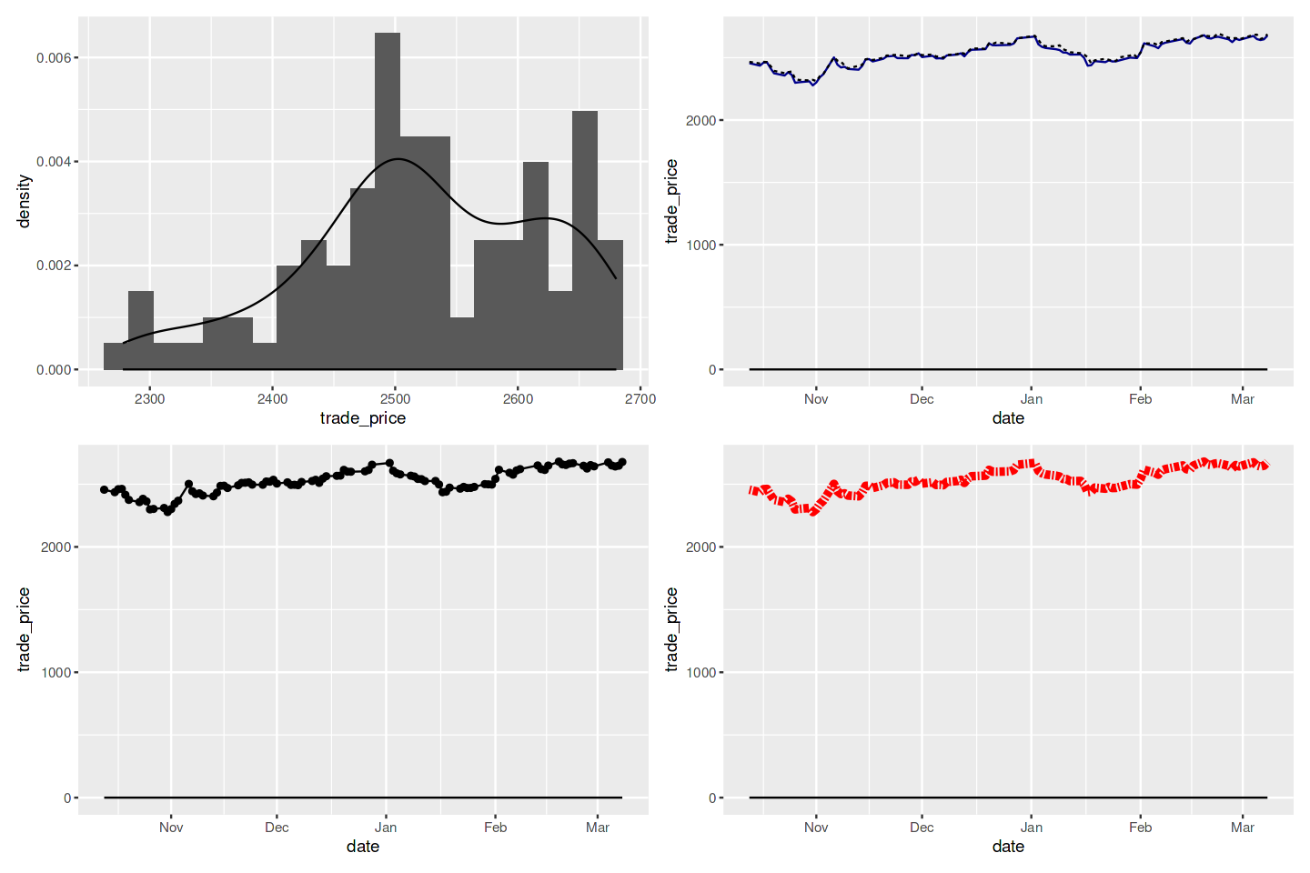
10. 한 페이지에 그래프 여러개 그리기
문제 : 한 페이지에 여러 개의 그래프를 나란히 놓고 싶다.
해결책: ggplot 그래픽들을 그리드에 넣는 방법은 여러 가지지만, 가장 쉬운 방법은 토머스 린 페데르센(Thomas Lin Pedersen)의 patchwork를 이해하고 사용하는 것이다. patchwork는 현재 CRAN에 올려져 있지 않지만, devtools를 사용해 깃허브에서 설치할수 있다. 패키지를 설치한 후, ggplot 객체들 사이에 + 를 넣어 다수의 그래프를 그린 다음 plot_layout을 호출해서 이미지들을 그리드로 정렬할 수 있다.
1
2
3
4
5
6
7
8
9
10
11
12
13
14
15
16
17
18
19
20
21
22
23
24
25
26
27
28
29
if(!require(patchwork)) devtools::install_github("thomasp85/patchwork")
library(patchwork)

df = tail(org_df, 100)
g1 = ggplot(df) +
    aes(x = trade_price) +
    geom_histogram(aes( y=..density..), bins=21) +
    geom_density()

g2 = ggplot() +
    geom_line(data=df1, aes(date, trade_price), color = "darkblue") +
    geom_line(data=df2, aes(date, high_price), linetype = "dashed")

g3 = ggplot(df, aes(x=date, y=trade_price)) +
    geom_point() +
    geom_line()

g4 = ggplot(df, aes(x = date, y = trade_price)) +
    geom_line(linetype = 6,
              linewidth = 2,
              col ="red")

g1 <- g1 + stat_function(fun = function(x) dbeta(x,2,4))
g2 <- g2 + stat_function(fun = function(x) dbeta(x,4,1))
g3 <- g3 + stat_function(fun = function(x) dbeta(x,1,1))
g4 <- g4 + stat_function(fun = function(x) dbeta(x,1,1))


g1 + g2 + g3 + g4 + plot_layout(ncol = 2, byrow = TRUE)
1
Loading required package: patchwork
데이터 셋과 실제 사용한 코드는 다음 Kaggle 주소를 참고할 수 있다.
https://www.kaggle.com/datasets/leesanghun1210/kospi-20240308-csv/code